Make breadth feel like choice, not complexity, through visible category architecture and confident merchandising.
Forma
Making a large catalogue feel approachable.
A fashion storefront that gives women, men, children, footwear and accessories a clear place without making the catalogue feel heavy.
View live site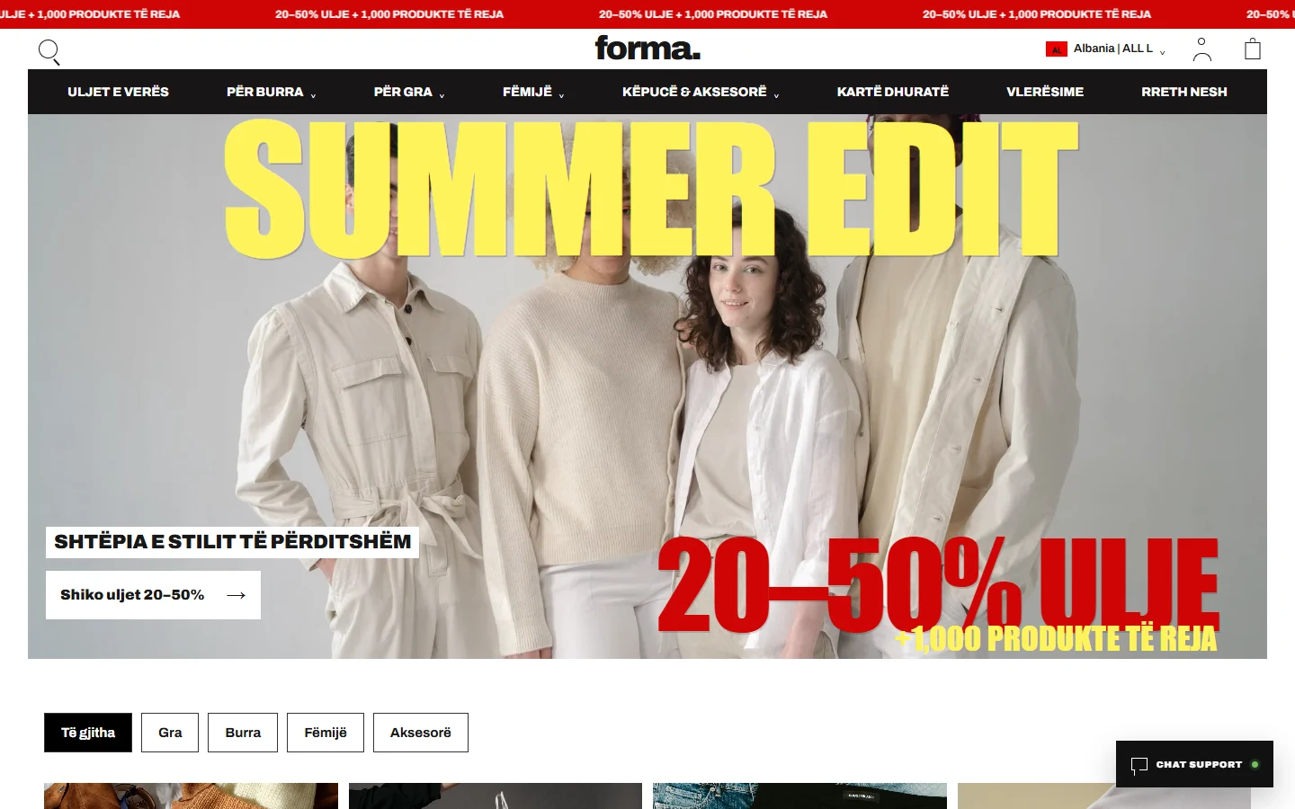
One storefront, multiple audiences
Women, men and children need clear entrances into one broad range.
Forma treats catalogue size as an information problem. Strong audience and category signals let shoppers narrow the range before density becomes tiring.
- Catalogue scale
- Category architecture
- Merchandising
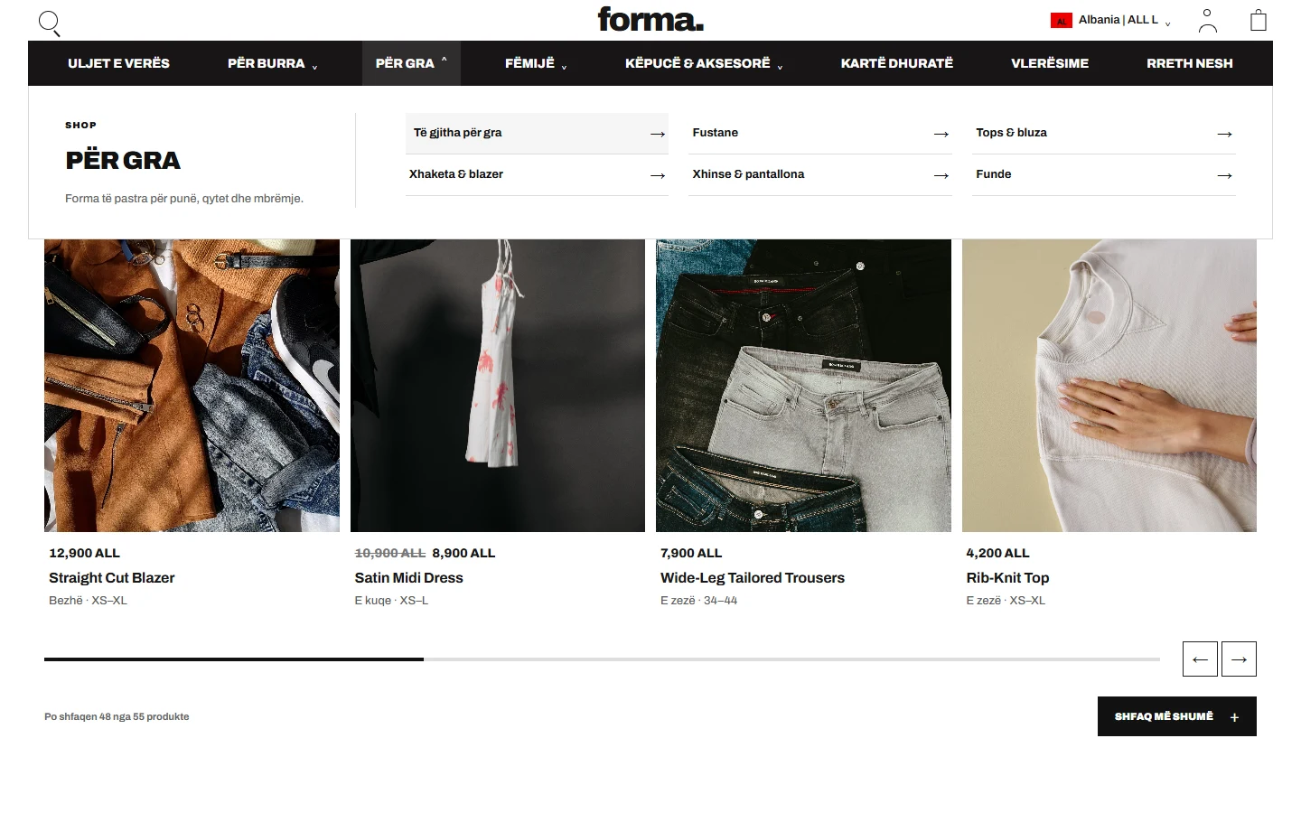
01 / Category architecture
A large catalogue becomes a set of understandable choices.
Audience, product type and collection are arranged in a hierarchy that supports both purposeful shopping and open-ended browsing.
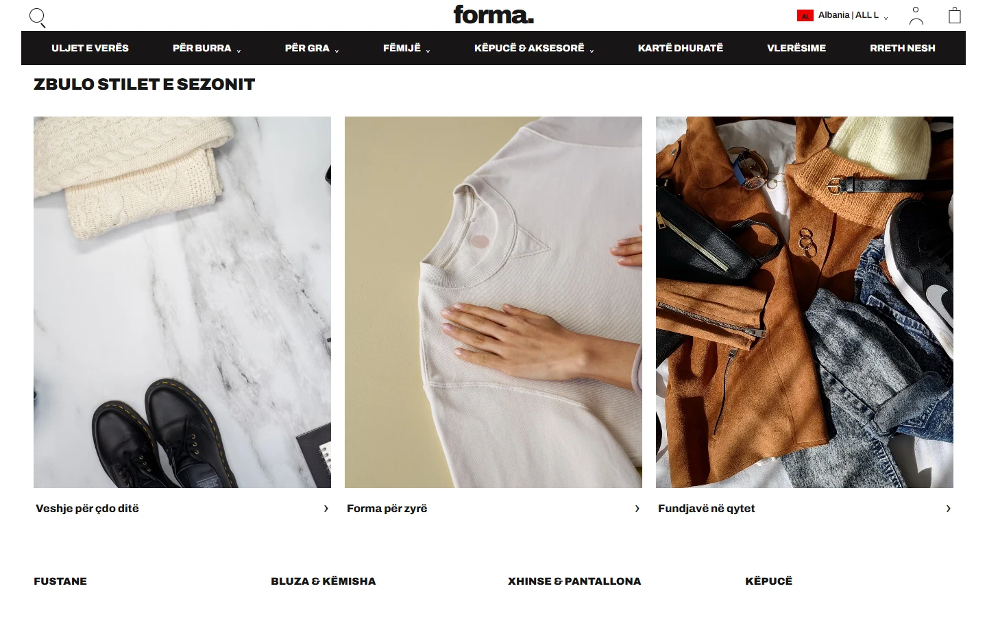
02 / Merchandising
Campaign moments create focus inside the range.
Editorial modules give launches and seasonal stories enough presence while keeping clear routes back into practical product discovery.
03 / Mobile commerce
Breadth remains manageable when space becomes limited.
The responsive storefront preserves audience cues, product rhythm and useful navigation without shrinking a desktop composition into a narrow crop.

Scale becomes useful when hierarchy remains obvious.
Selected design details
Idea / direction / experienceWHAT THE SYSTEM
NEEDED TO DO.
An editorial layout balances large campaign moments with practical catalogue entry points and a calm, flexible visual rhythm.
Collections, audience categories and product groupings help customers move from broad intent to the right part of the range quickly.
Working websiteSEE IT IN ITS
View live site